
Timeline
June 2025 - August 2025
Client
Experience Design Lab
Role
Junior UX Specialist
Assessing the new Tribunals Ontario website
I supported the Tribunals Ontario communications unit on their to-be-launched modernized website by leading a usability testing research sprint. In a team of two designers (myself as project lead and a co-op student), we aimed to seek and assess feedback on the new website before their projected launch in September 2024.
Simplifying the way to justice
The Tribunals Ontario communication unit is working to modernize their existing website to enable a supportive online experience for their users who navigate tribunal services, boards, and commissions. As part of their initial work, the communications unit has moved their existing website content into a new approved template design.
To support their modernization project, I conducted usability testing to seek and assess feedback on the new website.
How might we…
create a more intuitive and supportive online experience for users navigating tribunal services, boards, and commissions?
Addressing user needs
In this phase of research, we set out to understand how users would:
Understand users' needs and expectations of the service
Evaluate the comprehensibility and usability of the website
Disclaimer
This study does not include usability findings for related Tribunal Ontario forms and portals. The primary focus was placed on users navigate and comprehend the content on the main Tribunals Ontario website and sub-pages.
Ensuring diversity in our voices
Our recruitment ensured that our participants were reflective of Tribunal Ontario's diverse users and their needs.


5 call staff interns

We also aimed to hear from users who have engaged with various Tribunal services.
5 Human Rights Tribunal of Ontario
5 License Appeal Tribunal
7 Landlord and Tenant Board
1 Fire Safety Commission
1 Assessment Review Board
17 sessions of combined interviews and contextual observations
User interviews
Participants were initially asked about their previous experiences with Tribunals Ontario and navigating the current website. We later observed how our users navigate and find information for various steps of Tribunal-specific application and appeal processes.
A screenshot of our Miro board where we documented user insights and analysis.
Making sense of our findings
We grouped our findings into three themes:
Please note that for the purposes of this study, our team did not mock-up our solutions. However, our recommendations are highlighted in each section.
Navigation
How can we make information easier to find?
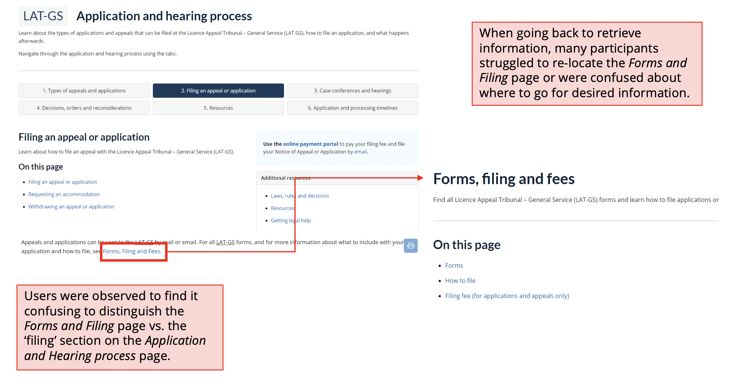
Users experienced challenges with hidden information, redirecting across site content and pages, as well as distinguishing tribunal-specific and global site content.
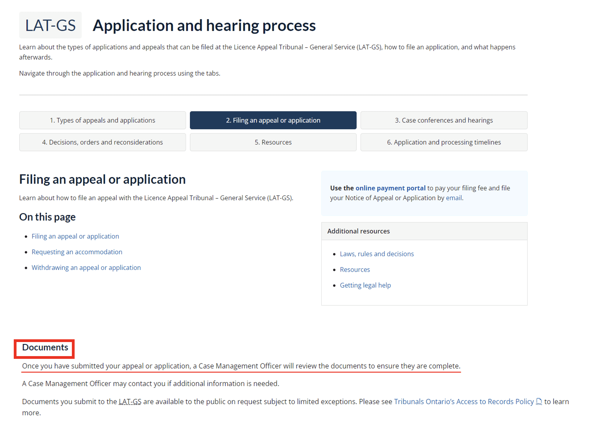
Example of important informational navigation links embedded within content pages.
Challenges
Key information hidden
Users had trouble finding key information, which was often buried or hard to spot. They wanted clearer formatting, fewer clicks, and quicker access to important content like timelines, phone numbers, and forms.
Poor redirects
Users faced navigation issues due to missing back buttons, broken links, and confusing paths, which led to frustration and reduced confidence in using the site.
Lack of distinction between global and sub-sites
Users were confused by global navigation, expecting it to be tribunal-specific. They found the search bar unhelpful for the same reason and wanted more filtering by tribunal across the site. Many missed the hamburger menu, or wished it was more visible earlier.
Solutions
Improving homepage IA
Highlight key information like contacts and timelines, and make embedded links more visible by using underlining.
2 navigation streams
Recommendation to have two navigation streams on the homepage, providing quick links to forms and portals for experienced users and directing less experienced users to steps of the filing process.
Visual confusion between global navigation and sub-site content
Page flows are confusing for users to navigate to their desired or expected content.
Content
Ensuring information "makes sense"
Many users were overwhelmed and confused with the content on the website, including inaccurate labelling and descriptions, inaccurate and missing information, information overload, and unclear language.
Some users pointed out that the headers were unclear, making it difficult to know what information would be available.
Challenges
Information is not where users expect it to be
Participants often couldn’t find information where they expected, especially details about submitting applications, which were scattered across guides, forms, or headings.
Missing and inaccurate content
Including processing timelines, form instructions, and guidance for uncommon situations. Users also wanted clarity on which communication channels to use for specific questions.
Solutions
Increasing visibility of relevant information
Recommendation to ensure content is current, placing key information—like forms, next steps, and timelines—higher on pages, and ensuring it's organized under clear, relevant headings.
Addition of accessibility features
Recommendation to add supporting diagrams (e.g., flow charts) and instructional videos for visual and audio alternatives.
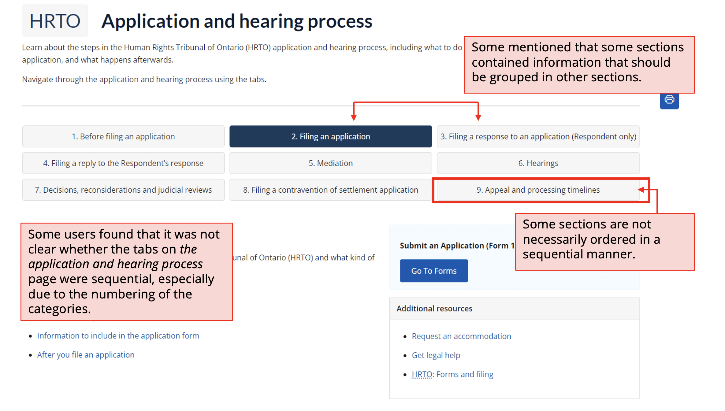
The displayed buckets were assumed to be sequential step-by-steps for the application and hearing process.
Many users found that information they were seeking was found on pages or sub-sections that they felt weren’t appropriate or unclear.
Forms
Improving form clarity to support timely filings
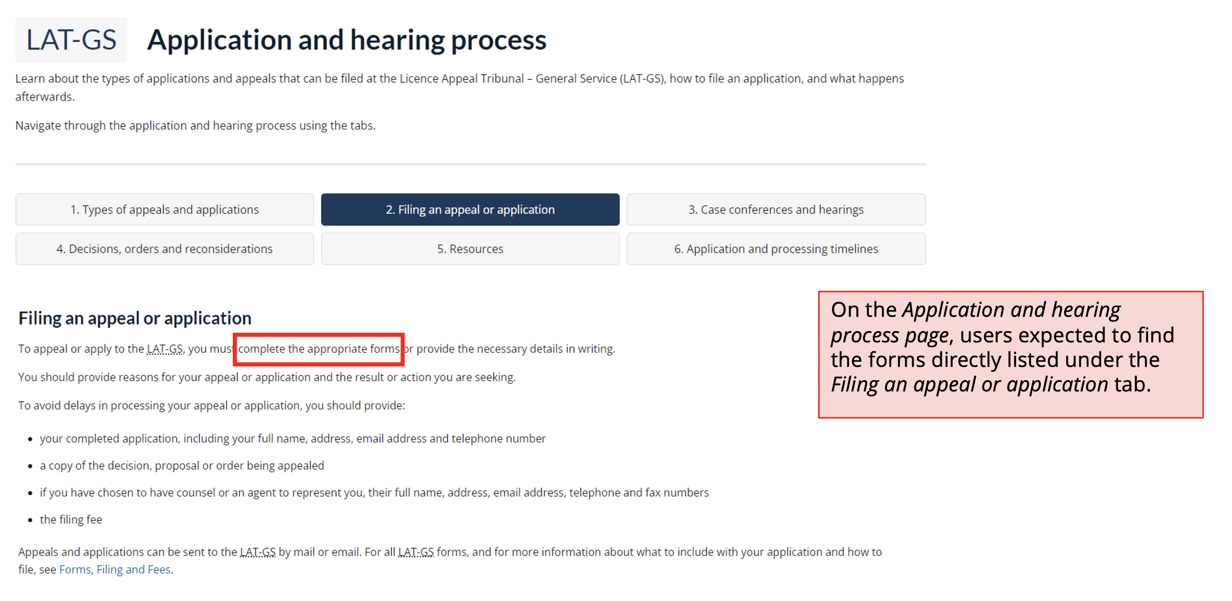
We heard from users that they struggle to navigate to relevant forms on the forms and filing page, as well as difficulty identifying which forms they should be using.
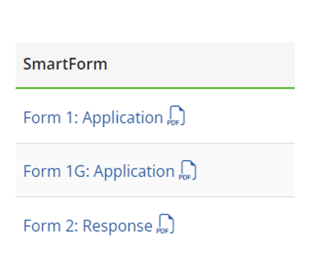
Lack of clarity between different application forms (no descriptive text).
Challenges
Difficulty navigating to relevant forms page
Participants had trouble finding application and appeal forms, often confusing different pages and struggling to retrace their steps. They wanted forms to be centralized and linked directly from relevant pages to reduce navigation confusion.
Difficulty identifying the correct form to use
Participants found it hard to distinguish between forms due to unclear naming and a lack of descriptions. They were unsure which form to use, especially at the start of the process, and noted confusion around submission methods.
Solutions
Centralizing information
Recommendation to centralize all form and filing information onto the same page/sub-section.
Improving form specification
Recommendation to rename forms for clarity, adding descriptions, separating main and supplementary forms, and hyperlinking forms within process steps across all Tribunals.

Example of lack of form clarity and guidance.
Next steps
Scaling up and widening the scope
The current usability testing research was limited to assessing users’ navigation and comprehension of site content. As such, our team recommended to the Tribunals team to consider future research on the usability of forms and the application portal for their mitigation project. This will help them to achieve a comprehensive understanding of the Tribunals Ontario site’s overall usability.
Another effort we recommended is an in-depth content review to identify outdated or otherwise irrelevant content, as well as to prioritize plain language and digestible information.
2025 update: The Tribunals team has considered and implemented recommendations to their website here.
