

Timeline
January 2024 - April 2024
Client
Ministry of Colleges and Universities
Role
User Experience Designer (co-op)
Making student loans more accessible
For my final capstone project with the University of Toronto, a group of students and I partnered with Ontario Digital Service and the Ministry of Colleges and Universities to conduct user testing and determine solutions to help students in Ontario better find information about post-secondary funding opportunities.
OSAP is designed to provide financial support to Ontario students pursuing higher education, with core interactions occurring through its online portal.
However, the OSAP website has several barriers to efficiently access key information and resources about the application process prior to registering and signing into the service.
How might we…
…redesign the OSAP website to create a more accessible, intuitive, and supportive information-seeking experience for Ontario students?
Exploring the problem space
We kicked off our design journey with a comprehensive review of the current experience using the OSAP website. Our team explored findings that were revealed during previously conducted discovery user research.
Key takeaways
The previously conducted discovery research helped our team to define our focus areas for the redesign:
Intuitive
Displaying information in a way to match the user's natural mental model.
Streamlined
Ensuring the information-seeking process is simple and clear.
Comprehensive
Prioritizing all relevant and important information.
Who are we designing for?
OSAP is used by students who are interested in, or are currently enrolled in post-secondary education.
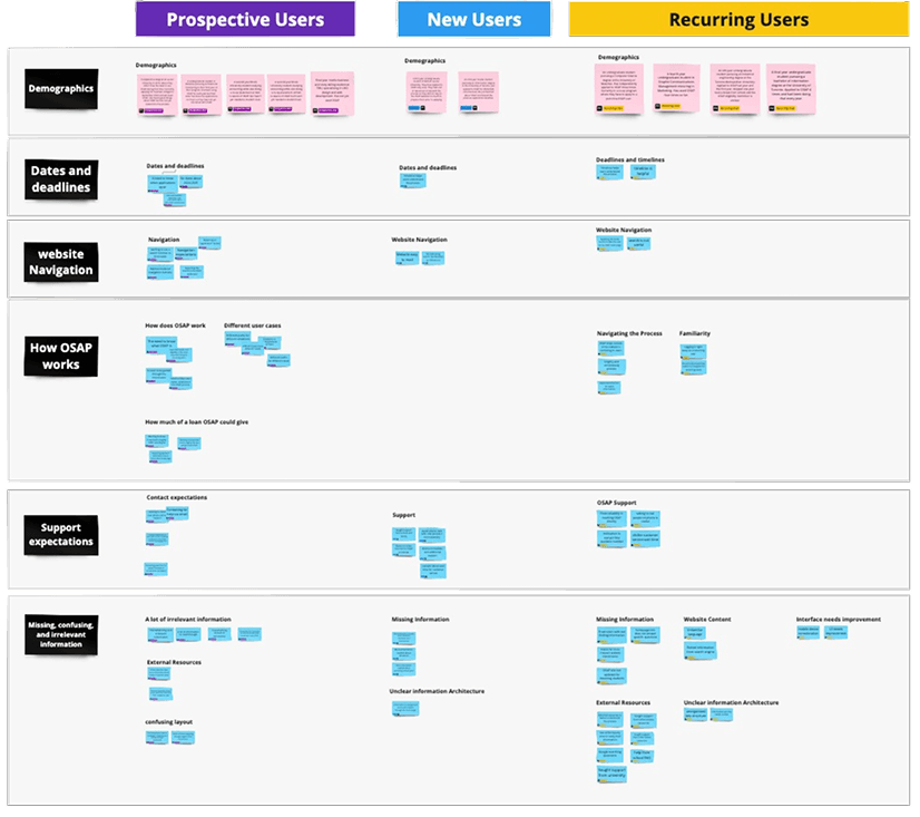
We conducted 13 semi-structured interviews and usability tests across three different user groups.
Acknowledging limitations
Our team recognized that OSAP is also accessed by parents and guardians of prospective or existing users. However, they were not recruited for this study due to time limitations.

Prospective users

New users
Users who have interacted with OSAP for the first time within the past year

Recurring users
User story
To humanize our users and guide our solutions, we created a user persona based on previously conducted user research. This was used to build out current user journeys and identify existing pain-points.
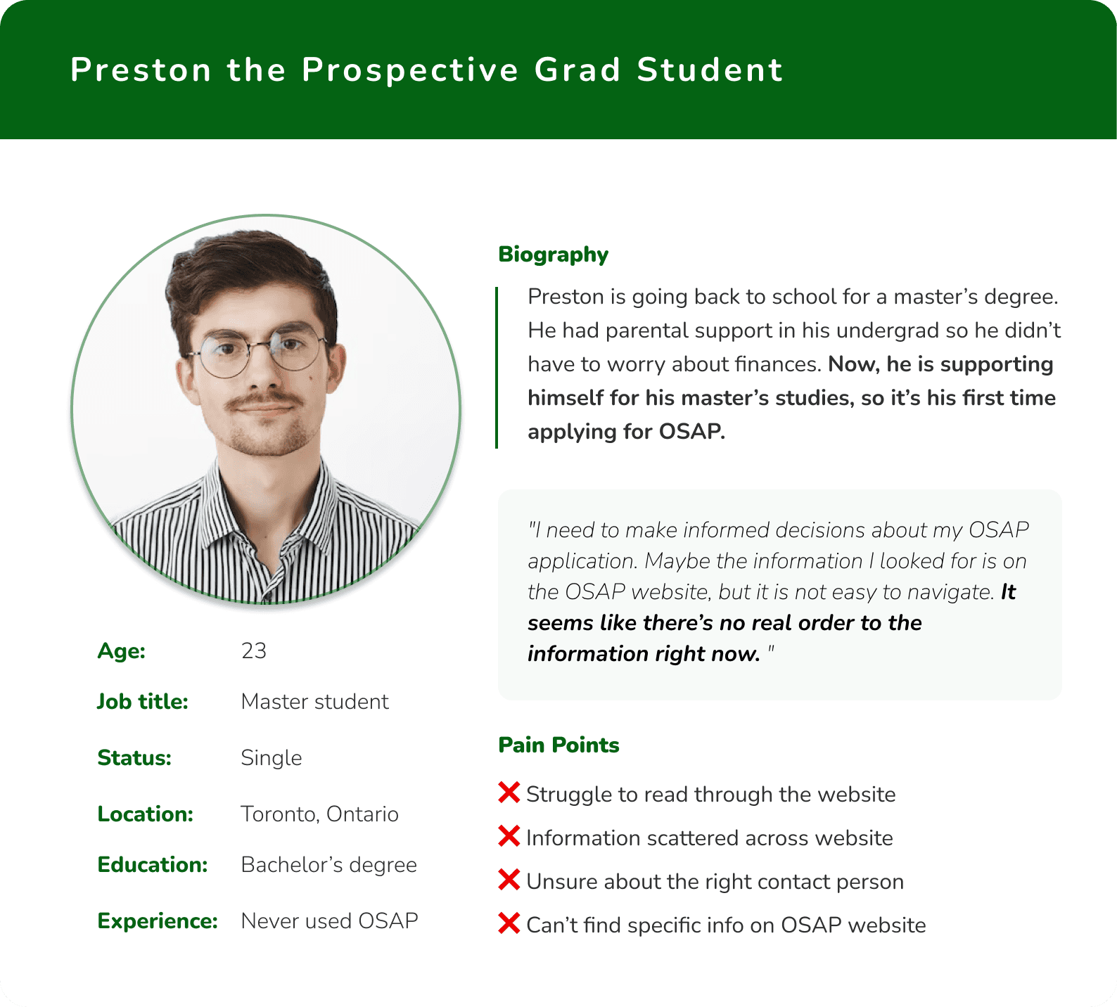
A screenshot of our persona.
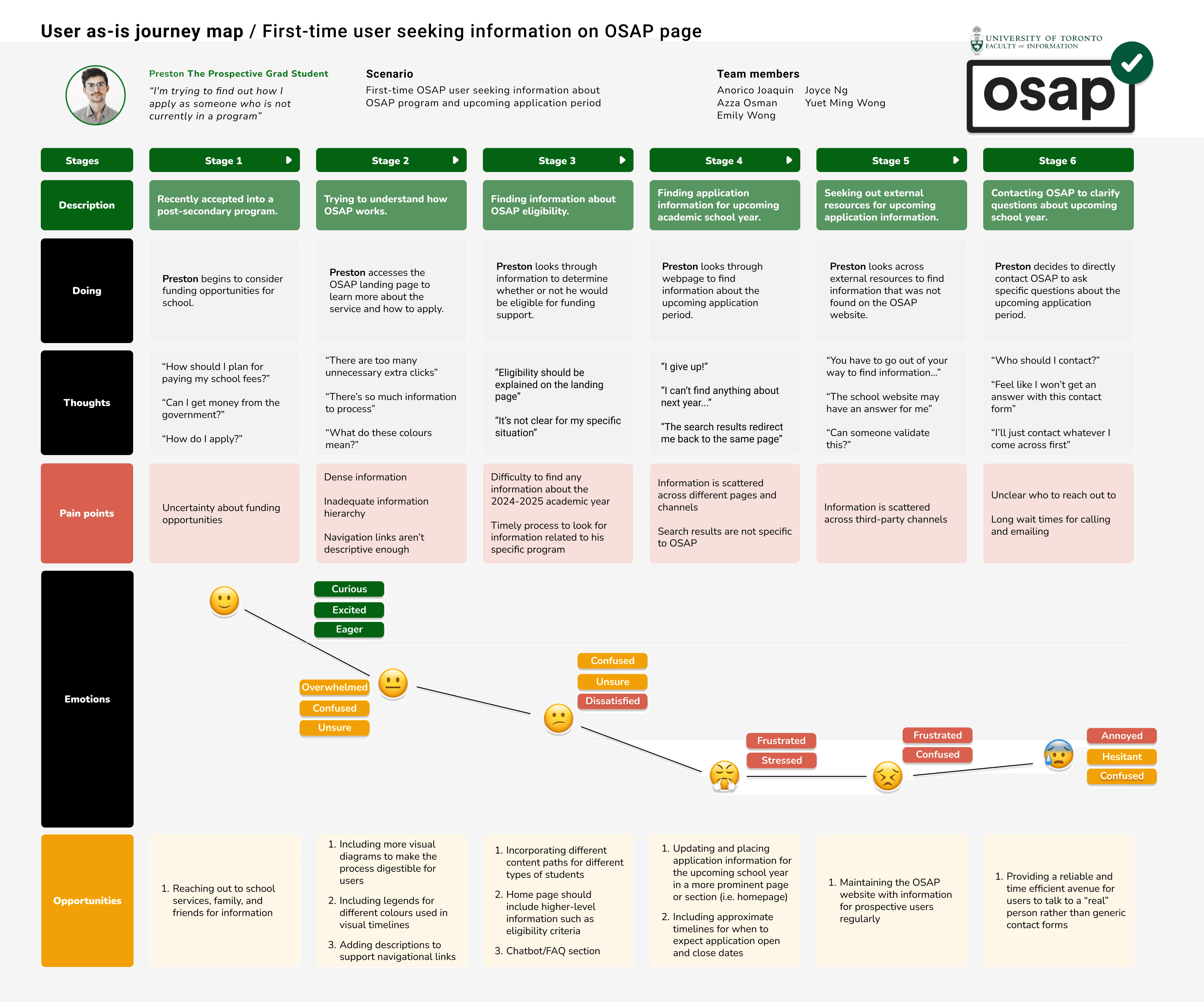
A screenshot of our journey map.
Understanding our data
Before discovering our insights, my team and I compiled and clustered sub-themes from our interview data. These clusters were used to help inform and generate overarching themes, journey maps, and user personas. This helped our team to understand the current-state of the OSAP homepage and the user flows.
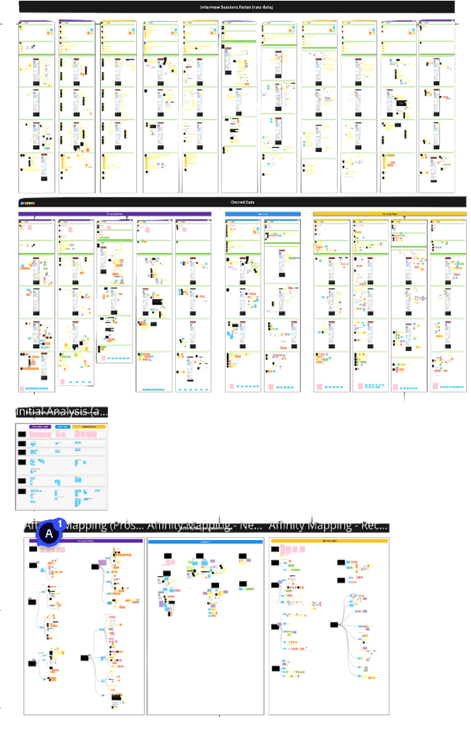
A screenshot of our Miro board where we documented user insights.
Breaking down the problem
Deriving from our thematic analysis, our team identified five (5) key problem areas to focus on:
Challenge
Challenges in understanding the application process
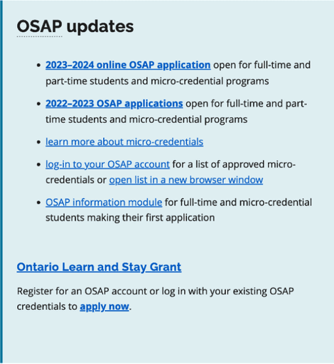
Users resort to finding answers through external resources, as they find themselves needing to scroll through information-dense pages to find what they were looking for on the OSAP website.
Difficulty finding relevant dates and deadlines
Although the website includes a timeline that explains the process, it does not include relevant dates for users to keep in mind while preparing to apply.
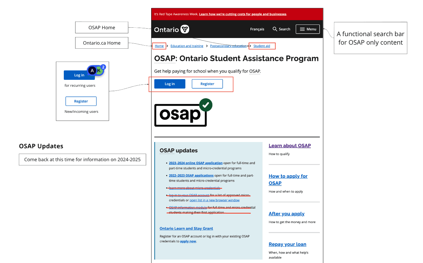
Unexpected and complicated website navigation
Users expected breadcrumbs and search bar to be localized to OSAP-specific content. However, users were frustrated to find themselves navigating the global Ontario.ca site.
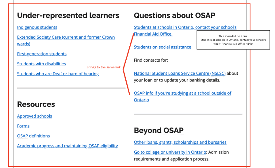
Missing, confusing, and irrelevant information
Users were overwhelmed and felt frustrated while reading through sections to find relevant information and answers to their questions.
Support expectations are not met
Users cannot rely on prompt and convenient answers by filling out an email form. They are more inclined to call the first number they see to address their inquiries.
Turning our ideas into solutions
Our team conducted a brainstorming session where we ranked design solutions to ideate future changes.This exercise guided our low and mid-fidelity visions of the potential changes to be implemented.
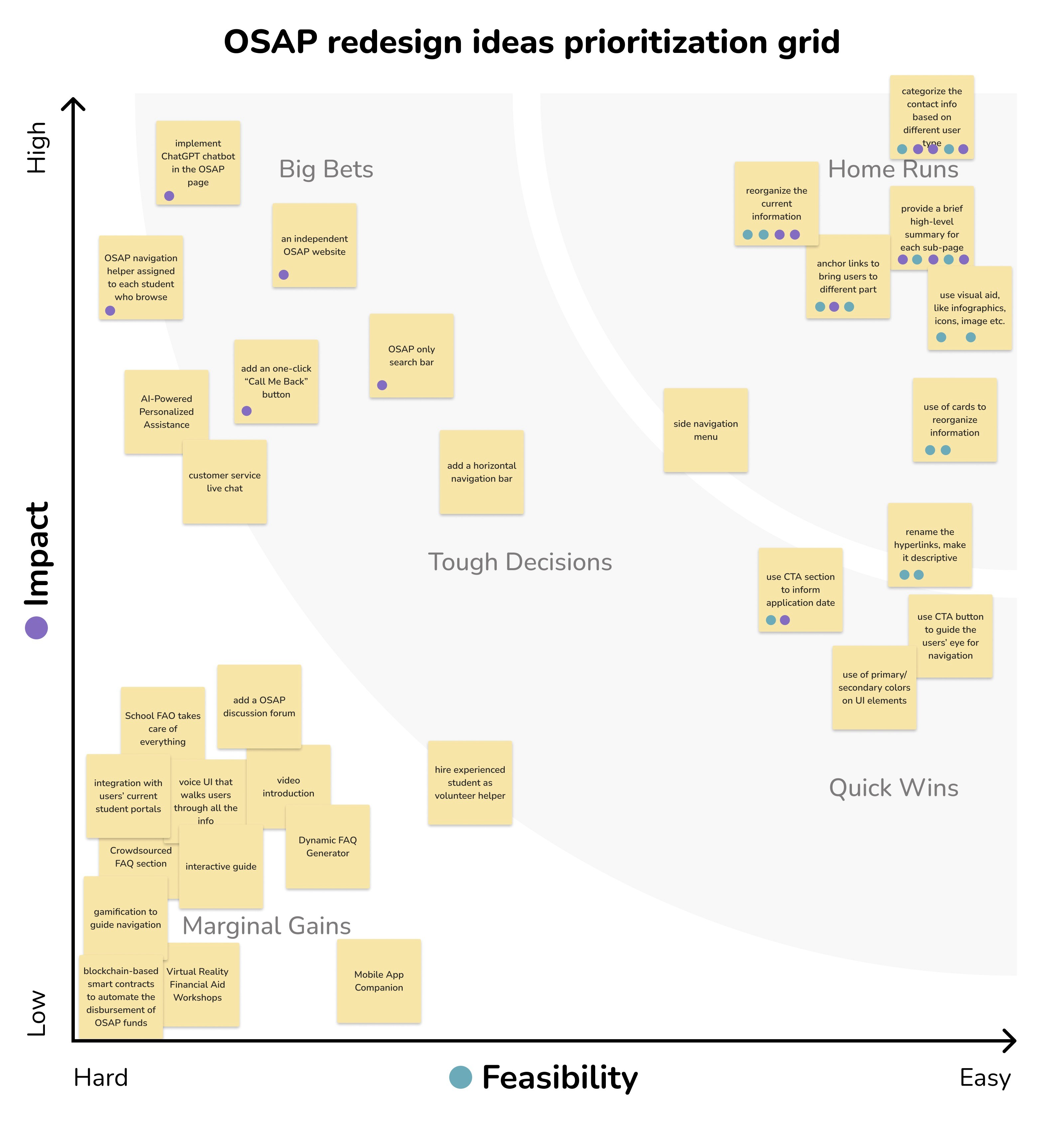
Our changes
Guided by our design goals and key takeaways, each of the following highlights captures our proposed changes to the OSAP experience.
Easier navigation to finding information
We highlighted vital information on the homepage, including application timelines and deadlines, eligibility for different educational programs, an estimate of how much funding students can receive, and the right personnel to reach out to for personalized answers.
I want an idea of how much money I could receive… but I can't find the aid estimator tool.

Before and after redesigning the call-out messaging.


Added in "on this page" table of contents and external navigation links for other content on the OSAP website.
Highlighting key information
We categorized relevant links and introduced tertiary buttons to reduce visual clutter. The added high-level descriptions in each section helps users understand how OSAP works and eliminates the need to navigate across several pages.
I want to learn about what happens after I apply for a loan. Where is that information?
You can now find that information in the "after you apply" section!
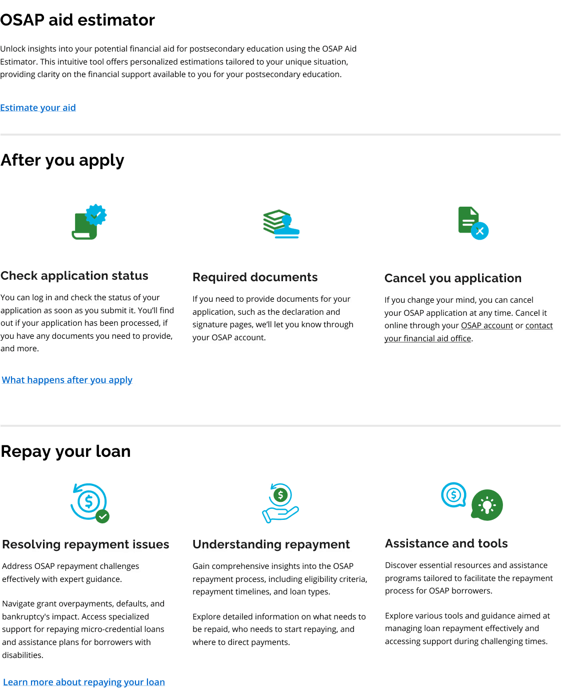
New visual cards to highlight relevant information about the OSAP application process.
Visual representation of the application process
We added a visual timeline to the homepage to walk users through the application process, ensuring that key steps of the process are highlighted and clear.
I'm a bit confused about the application process and timelines. Too many words… gah!
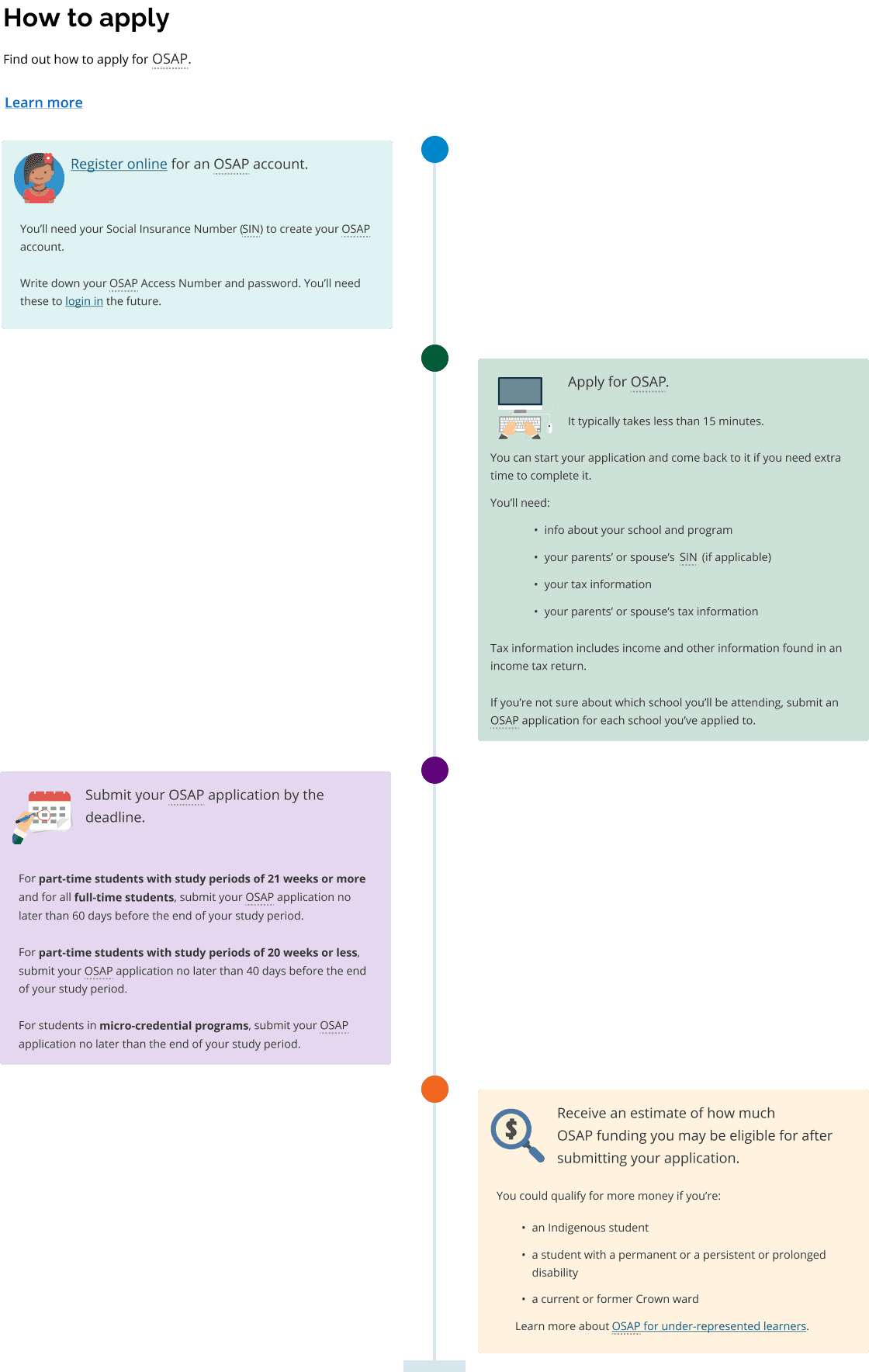
New added-in visual timeline.
Displaying help and support pages
We added visible and clear help and support pages at the bottom of the landing page. Additionally, we explored the idea of adding a "general inquiries" contact section.
I'm struggling to find specific eligibility criteria. I'm going to Google a number…
Now you can easily find additional help and support pages from the landing page!


New added-in visual timeline.
Added feature: local navigation bar
Currently, the ontario.ca parent website does not have a localized navigation bar in their design system. This results in users engaging with the global navigation bar and receiving non-OSAP related content. Beyond adding in-page navigational hyperlinks, our team mocked up a secondary navigation bar for program-related content.

New added-in visual timeline.
Changing the first impression
Let's break down our impact
Our solution addresses user's concerns by ensuring clear information and hierarchy upfront, pushing for a more accessible, streamlined, and intuitive experience using the OSAP website.

To view our Figma prototypes, click here.
With our redesign efforts, our team aspires to resolve the challenges experiences by both our end users and our industry partners in delivering financial services.
Increasing student confidence when applying to OSAP
Reducing administrative burden for the ministry's call centre
Increasing engagement on the OSAP website
How did it go?
Now for a retroactive…
Our team shared our insights with the OSAP team to support their future work in transforming the OSAP website. Although our scope was limited to the homepage, our insights will be leveraged in their project work for other segments of the process, including content belonging to related pages and the application submission process.
Personal learnings
Leveraging internal teams
During our design process, we talked to a variety of internal staff members including those who have worked on the OSAP project before and the design system team. This helped guide our research planning and proposed solution.
The value in working closely with your partners
We ensured that our client was regularly updated with our progress to encourage collaboration and ongoing feedback. This ensured that our next steps continuously aligned with the project objectives from both the ODS and course requirements.
